WORK THAT
MOVES
BRANDS.

Not pretty images. Strategic transformations — with context, reasoning, and the outcomes that followed.

FOUR PROJECTS.
FOUR REAL STORIES.

Every case study here follows the same structure: what was broken, what we understood about it, how we built the solution, and what changed as a result. These aren't portfolio images. They're documented decisions.

4
Case Studies
100%
Hospitality &
Brand Clients
0
Template
Solutions
Brand Identity Hospitality 2025

VISUAL IDENTITY
SYSTEM

Multi-Location Restaurant Group — Full Brand Rebuild

Premium brand identity system — Future Marketing Studio visual identity work 
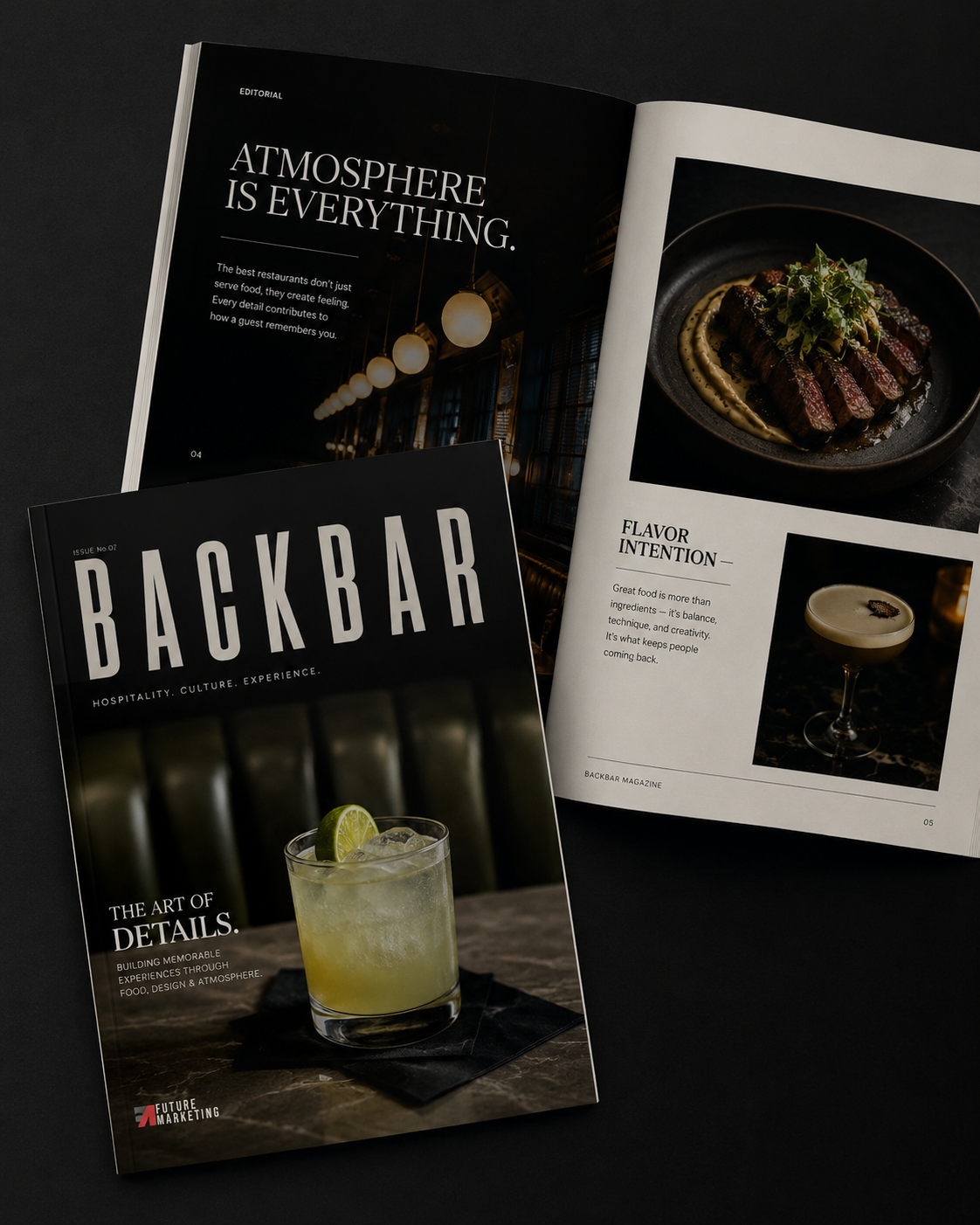
Brand identity system — restaurant group

The Situation

A multi-location restaurant group had been operating for three years with a fragmented visual identity. Each location looked different online. The menu didn't match the social presence. The website didn't match the in-venue experience. The food was extraordinary. The brand was invisible.

What We Understood

The problem wasn't design quality — it was the absence of a system. Every touchpoint had been created independently, by different people, at different times. There was no shared visual language. Customers experienced a different brand every time they encountered the restaurant online vs. in person.

The Build

We started with a brand positioning session — not a mood board. Understanding the emotional experience the restaurant was actually creating (vs. claiming to create) gave us the strategic foundation before a single visual was designed. From there, we built a cohesive identity system designed to hold at any scale.

The Principle

Premium perception isn't manufactured — it's revealed. This brand already had the substance. Our job was to design a visual system that expressed what was already there. When the brand finally matched the food, guests stopped underestimating it.

Deliverables

  • Complete logo system — primary, secondary, wordmark, favicon
  • Color palette with usage rules across print and digital
  • Typography system with hierarchy guidelines
  • Photography direction and moodboard
  • Brand standards document (full PDF)
  • Menu design system — implementable across locations
  • Social media template library (8 formats)
  • Stationery suite and launch assets

Outcome

The new identity was implemented across all locations within 8 weeks. The next quarterly menu cycle included a price increase across food categories — not because costs rose, but because the brand finally matched the quality of the dining experience. The visual system became the foundation for subsequent location launches, eliminating the "start from scratch" cost of expansion.

15%
Price increase at next menu cycle post-rebrand
Editorial Design Print & Digital Bar Culture

BACKBAR
MAGAZINE

Bar Culture Editorial — Design System & Identity

BACKBAR Magazine editorial design — Future Marketing Studio bar culture publication BACKBAR Magazine — editorial design system

The Situation

The bar and cocktail culture space had no premium editorial voice. Content in the industry was functional at best — menus, promotions, drink photos. No publication or brand was treating the craft of bartending and atmospheric hospitality with the visual gravity it deserved.

What We Understood

Bar culture is one of the most atmosphere-dependent industries in hospitality. The entire value proposition of a premium bar is the feeling it creates — but almost no brand in the space was communicating that feeling through its content. The visual opportunity was wide open.

The Build

We conceived BACKBAR as a cinematic editorial property — not a marketing vehicle, but a genuine publication voice for bar culture. The design language drew from fashion editorial, film photography, and luxury magazine standards applied to the hospitality context.

The Principle

When you give a niche the visual treatment it deserves but has never received, it becomes magnetic. BACKBAR didn't have to compete — it simply occupied a space that didn't exist before. That's the power of applying editorial gravity to an underserved category.

Deliverables

  • Full editorial layout system — grid, margins, typographic hierarchy
  • Custom masthead and publication identity
  • Photography direction for atmospheric and subject-driven shots
  • Feature article layout templates
  • Column and department page designs
  • Print and digital-optimized formats
  • Brand guidelines for ongoing contributors

Outcome

BACKBAR established a new visual benchmark for bar culture editorial content. The layout system proved replicable across seasonal and ongoing issues — creating scalable content infrastructure that maintained visual quality without redesigning from scratch each time. The most significant outcome: the design language itself became the identity. People recognized the publication before reading the name.

System
Built to scale — every future issue starts with a foundation, not a blank page
Campaign Hospitality Marketing 2025

OWN THE
GOLDEN HOUR

Hospitality Brand Campaign — Experience-Led Marketing

Own The Golden Hour — Future Marketing Studio hospitality campaign Own The Golden Hour campaign — visual system

The Situation

A hospitality brand was underleveraging its most emotionally powerful daily moment — the transition from afternoon to evening. The 4–7pm window was generating average covers with no brand amplification. The offer existed. The atmosphere existed. The marketing treated it like a discount slot.

What We Understood

The golden hour isn't a deal. It's a state of mind. That window carries specific emotional associations — the quality of the light, the shift in energy, the feeling of the day releasing. We understood that the marketing problem wasn't awareness — it was framing. People needed to feel the invitation before they saw the menu.

The Build

We built the campaign around atmosphere first, offer second. The visual system used warm tones, cinematic compositions, and copy that addressed the feeling of that specific hour — not the price. "Own The Golden Hour" positioned the time slot as an identity, not a promotion. The brand became the gateway to an experience people already wanted.

The Principle

The best hospitality marketing doesn't sell food or drinks — it sells the emotional state of being in the room. When you market the feeling accurately, the transactional decision (what to order, whether to come back) becomes almost automatic. Desire precedes decision.

Deliverables

  • Campaign concept and strategic positioning
  • "Own The Golden Hour" visual identity system
  • Photography direction and moodboard
  • Social media campaign assets — feed, stories, reels direction
  • In-venue signage and table materials
  • Email campaign design
  • Campaign guidelines for ongoing seasonal reactivation

Outcome

The campaign created a recurring promotional identity that can be reactivated seasonally without rebuilding. The shift from "discount messaging" to "experience marketing" changed how the audience engaged with the content — saves and shares increased significantly over transactional posts. The golden hour window became an anticipated event rather than a default time slot.

Recurring
Campaign reusable every season — no rebuild required
Social & Content Restaurant Emotion-Led Strategy

EMOTION-DRIVEN
BRAND CONTENT

Restaurant Social Media — Content Strategy & Identity

Restaurant brand storytelling — Future Marketing Studio social content strategy Brand storytelling — restaurant content system

The Situation

The restaurant's Instagram was functional but forgettable. Food photos. Weekly specials. Uniform, logo-heavy graphics. The account had followers but no emotional engagement. People liked posts but didn't feel anything — and social content wasn't driving traffic or return visits.

What We Understood

Most restaurants post what they make. The best ones communicate what people feel when they eat it. The content strategy wasn't wrong because it was low-quality — it was wrong because it was answering the question "what do we post?" instead of "what do we want people to feel?" Those are fundamentally different questions with fundamentally different answers.

The Build

We rebuilt the content strategy from emotion first. Three emotional pillars: atmosphere (the feeling of being in this place), craftsmanship (the pride in the product), and belonging (this place is for people like you). Every content format was designed to express one of these three things — and nothing was posted that didn't belong to one of them.

The Principle

Content that makes people feel something before they visit creates an expectation. When the reality matches that expectation, you don't just earn a customer — you earn an advocate. The goal of every post was to describe the experience so accurately that first-time visitors arrived already feeling like regulars.

Deliverables

  • Content strategy and emotional framework document
  • Visual identity for social media — color grading, composition rules, text treatments
  • Caption strategy — voice and tone guide
  • Content template library (5 recurring formats)
  • First 30-day content calendar
  • Photography direction brief for ongoing shoots
  • Engagement strategy and response guidelines

Outcome

Within the first full content cycle, saves and shares increased significantly — a metric that indicates content valuable enough to return to, not just scroll past. New customers began arriving having seen specific content pieces that described their experience accurately before they visited. The brand stopped posting to an algorithm and started publishing for a specific person — and the right people found it.

↑ Saves
Saves & shares up — content people return to vs. content people scroll past

YOUR STORY
BELONGS HERE.

Every project in this archive started the same way — a conversation. Someone decided it was time their brand matched what they'd built. That decision takes thirty minutes.

Client details are anonymized or used with permission. Outcomes reflect individual engagements and are not guaranteed. Results vary based on brand context, industry, and implementation.